American and European Art Post-1950
Grade:
High, University

Introduction
This guide explores highlights from the James M. Kemper Gallery of the Mildred Lane Kemper Art Museum, moving chronologically from the mid-twentieth century to today, and encountering artworks that invite us to consider how artists experiment with materials and processes and respond to the world around them.
Post-World War II Abstraction
Abstract Expressionism, action painting, tachisme, lyrical abstraction, and art informel are all terms used to describe the dominant approaches to visual art in the United States and Western Europe in the years immediately following World War II (1939–45). The trauma of the Holocaust, global warfare, and the rise of fascism led many artists to call for a break from the past. They rejected realist styles as too easily appropriated for purposes of propaganda and opposed the rational, analytic principles of geometric abstraction. Despite significant differences between European and American postwar artistic practices, ideologies, and sociopolitical conditions, a common interest in the use of the gestural mark to convey strong expressive content and an emphasis on the physical act of painting as a manifestation of artistic free will inform much of this work.

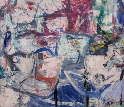
Take a moment to notice the colors and brushwork in this painting by Willem de Kooning. What kind of atmosphere do they convey?
Saturday Night (1956) pulses with layers of slashed, smeared, flicked, and scraped paint in primarily cool shades of pink and blue. The expressive brushwork oriented in multiple directions forms a network of marks that, considering the painting’s title, might be seen to suggest the gridded pattern of city blocks and the energetic atmosphere of a night out on the town.
Born in the Netherlands, Willem de Kooning moved to the United States and settled in New York City in 1927, where he went on to become one of the most prominent American Abstract Expressionists and part of an informal group of artists that came to be known as the New York School. Before moving to the United States, de Kooning apprenticed for a time as a commercial artist in the Netherlands, and he continued to support himself financially through house painting, commercial art, and contributing to Works Progress Administration–sponsored murals for about ten years after coming to Manhattan. During this period de Kooning also befriended modernist artists active in the city, including the Armenian-born artist Arshile Gorky (1904–1948) whose surrealist imagery was important to de Kooning’s artistic trajectory. De Kooning is perhaps best known for the semi-abstract works in his Women series begun in 1950, which take cues from earlier Cubist fracturing of form and space. By the late 1950s, de Kooning had shifted away from the figural imagery of his Women series to more fully Abstract Expressionist canvases like this one.
Although Abstract Expressionism is associated with the ideal of spontaneity, de Kooning’s work also challenges the idea of painting as an expression of a pure, authentic subjectivity. By manipulating his brushstrokes in several passages—blending or scraping the layers of paint—de Kooning introduced to Saturday Night an element of intentional artistic reflection that suggests a creative process driven by the artist’s consciousness and impulse for revision rather than by unconscious forces of the psyche.
William C. Seitz, former associate curator at the Museum of Modern Art, wrote that “Willem de Kooning’s paintings of female figures were an incarnation of the city.” Some scholars have also interpreted Saturday Night as evoking bodily forms. Do you agree that this painting brings to mind the human body? If so, which elements of the painting convey this to you?
Join Kemper Art Museum head of education Meredith Lehman in taking a closer look at Saturday Night in this immersive Slow Looking video.
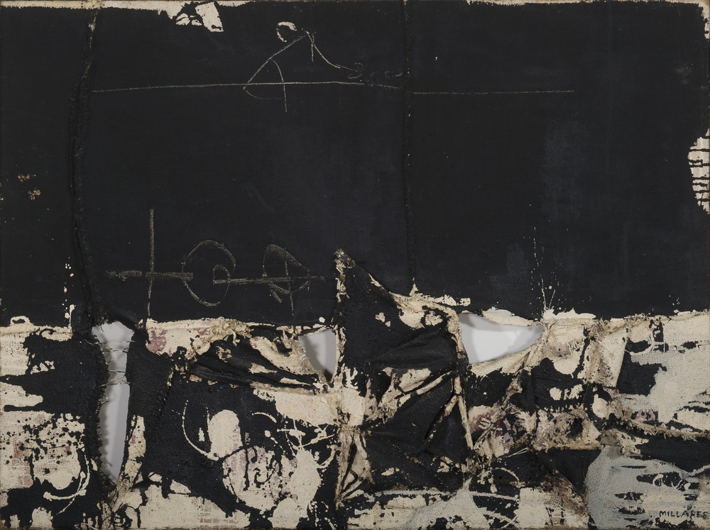
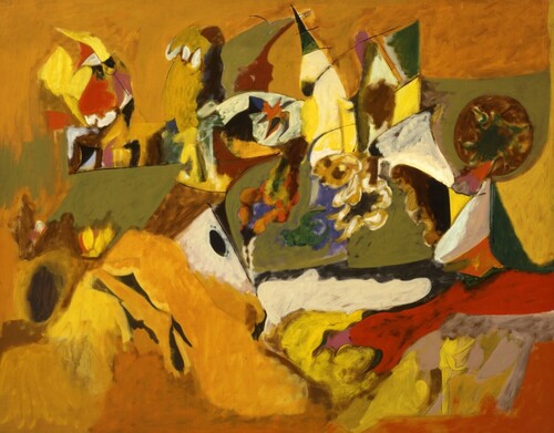
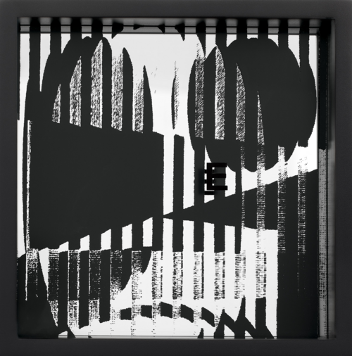
Take a moment to look at this painting by Spanish artist Manolo Millares. What draws your attention first?
A swath of black paint spans the upper portion of the canvas, while the lower register bursts into splashes of black, beige, and mauve pigment on tattered raw burlap. The burlap support has the appearance of being ripped and then hastily sewed back together; unmended holes reveal the wall behind the painting, and sutures running vertically up and down the work form ridges like scar tissue beneath the paint.
The meeting of the two horizontal sections near the middle of the painting evokes the horizon line of a landscape—like the intersection of sky and earth or the facade of a wall encountering the ground.
While Abstract Expressionism dominated the New York–centered American art world in the years following World War II, in Europe art informel (informal art) was the leading force in the art scene of the period. Coined by the French critic Michel Tapié, the term described an eclectic coalition of artists who adapted the unconscious improvisations and spontaneous methods of Surrealism, one of the few earlier movements whose ideas were considered relevant to the postwar condition. Manolo Millares was associated with art informel and more specifically with Spanish informalismo (informalism), an aesthetic characterized by dense materiality, intentionally crude paint application, and the use of unconventional materials such as wire, burlap, and sand.
Millares’s version of abstraction was embedded in the political context of Spain post World War II, both its newfound internationalism and the brutality of the Spanish dictator Francisco Franco’s repressive regime (1939–75). His work embodies explicit violence—he often ripped apart the painting surfaces, leaving gaping holes—as well as the reparative practice of sewing. Cuadro No. 82 (Painting No. 82) (1960) is one such work from a series made of torn and stained burlap. Millares began the practice of numbering his canvases in 1957, the same year he cofounded the artist group El Paso (The Step) in Madrid and began to gain broader international recognition for his work.
Art informel works were often interpreted as reflecting a contemporary nihilism, the result of an ongoing struggle to grapple with the physical and psychological effects of World War II, which some believed could not be depicted, only expressed. Millares’s punctured canvases—an effect he accomplished at times with the aid of a blowtorch—predominantly in black lend themselves to interpretations that center violence and destruction. In addition to these formal qualities, the sociopolitical context of midcentury Spain under the Franco dictatorship has shaped reception of Millares’s work. As Millares’s widow Elvireta Escobio reflected years after her husband’s death and Spain’s transition to democracy, “The paintings always have the pockmarks from firing squad executions on the walls, which still existed at that time.” Threaded together with the violence of the time made visible on the canvas is a sense of optimistic tenacity and belief in renewal that some contemporaries and scholars perceived in the artist’s work and which Millares expressed in some of his many writings:
“Destruction and love run neck-and-neck across dislocated space and landscapes. What does it matter if a man is broken when roses made of river mud and replenishing essences emerge from him like fists.” — Manolo Millares
What might you choose as an alternate title for Cuadro No. 82 and how does your title reflect your interpretation of this artwork?
Up Next: De Kooning’s and Millares’s paintings show two different approaches to gestural abstraction post World War II, addressing and responding to each of their respective environments. We now turn to artworks from the later twentieth century that draw from the imagery of popular and mass media.
Assemblage and Appropriation Art
The second room of the Kemper Gallery explores assemblage and appropriation art in the latter part of the twentieth century—movements and attitudes toward art-making that were in some ways rooted in, and in some ways reactions against, gestural abstraction. This questioning of what had come to be a dominant art form by a generation of artists coming of age in the period between the 1950s and 1970s coincided with the challenging of accepted norms and values in the realms of culture and politics—spurred on by world events such as the Vietnam War and social and intellectual movements including feminism and deconstructionism, which questioned the relationship between meaning and conventions of representation in image and text.
We will now turn to two artworks to further explore the techniques and underlying attitudes of assemblage and appropriation art.
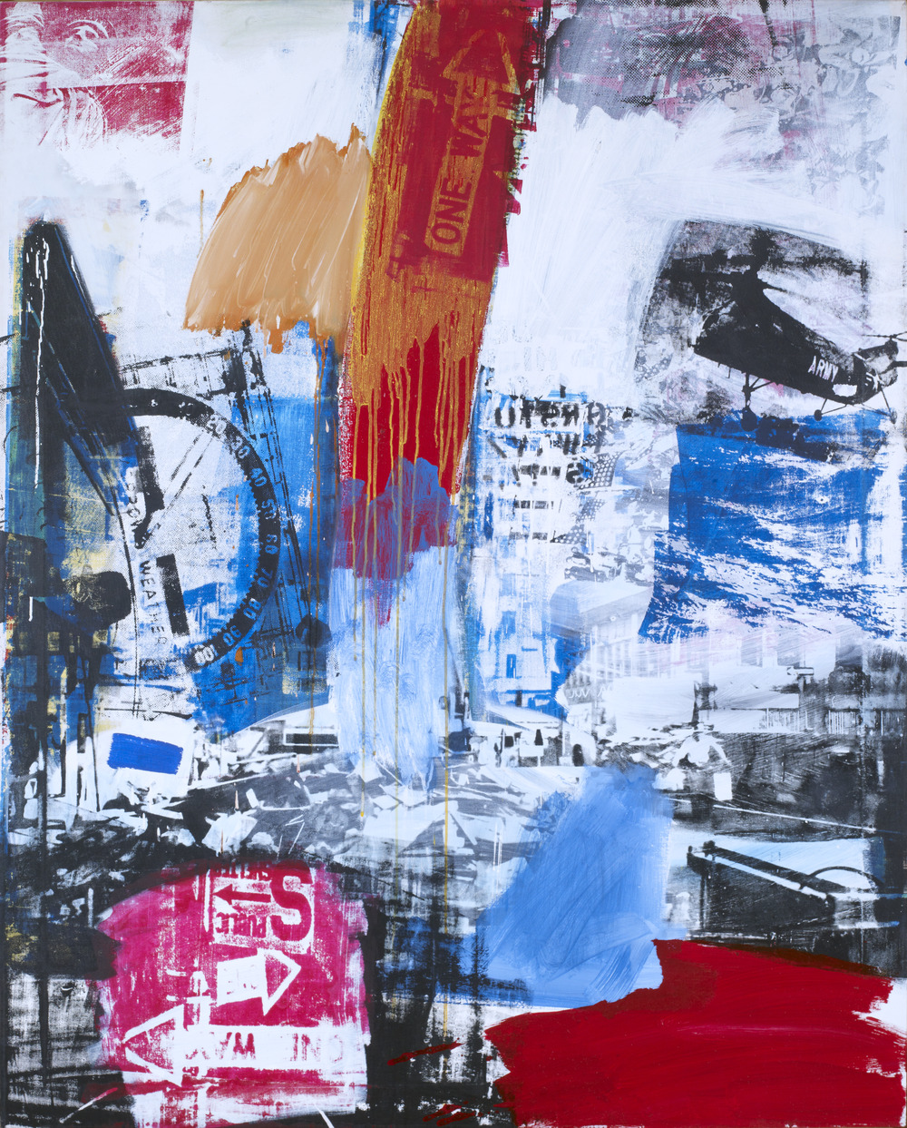
Take a moment to let your eyes wander around this picture. Do you notice any recognizable imagery?
Choke (1964) by American artist Robert Rauschenberg juxtaposes photographic fragments with painted passages employing the broad painterly gestures typical of Abstract Expressionism. Rauschenberg created this work using commercially produced screen prints based on media sources and his own photographs, and imbued these collage-like, reproduced images with an expressive quality through the inclusion of hand-painted areas and intentional irregularities in the screening process. While Rauschenberg saw his artistic focus as running in the “opposite direction” to that of the Abstract Expressionists, he did find inspiration in the creative handling of paint by artists such as Willem de Kooning, whom Rauschenberg praised in 1965 as “one of the greatest painters in the world.”
In addition to his screen-printed paintings, Rauschenberg worked extensively in performance and is well known for his assemblages of the 1950s combining elements of sculpture with elements of painting, which he called Combines. Assemblage, an artistic strategy initiated by artists associated with Dada and Surrealism in the early twentieth century, was embraced by artists like Rauschenberg who produced wide-ranging works that combine mundane, cheap, and readymade materials, including found objects and detritus. Through the unorthodox juxtaposition of everyday items and images, artists responded to and reflected a cultural and economic context shaped by mass production, consumption, and disposability.
Much of the imagery in Choke suggests Rauschenberg’s critical attitude toward Cold War American culture. The disjointed collage combining images of an army helicopter, a troop of Boy Scouts bearing flags, and the Statue of Liberty intertwines emblems of American patriotism with allusions to the Vietnam War. A “One Way” sign dominating the upper half of the canvas resembles a rocket angled upward, trailed by a plume of dripping orange paint. This prominent image could be read as a warning about the dangerous direction of modern warfare in an era of mounting anxiety over nuclear threats, though one could also find other meanings in the artwork’s combination of images and colors.
Rauschenberg did not wish for his artworks to contain straightforward messages or to take the form of what he called “cultivated protest.” Rather, he held that by making artworks that recorded his observations of his immediate surroundings in New York City his feelings about the world around him would eventually be made manifest:
“I have never thought. . . that problems were so simple politically, that they could, by me anyway, be tackled directly. But every day by consistently doing what you do with the attitude that you do it, if you have strong feelings those things are expressed over a period of time or in a few words as opposed to, say, one Guernica.” — Robert Rauschenberg
Do you perceive an overarching mood in this work? If so, what do you see that contributes to that mood?
What does the title Choke seem to connote? Do you think that the title fits this painting?

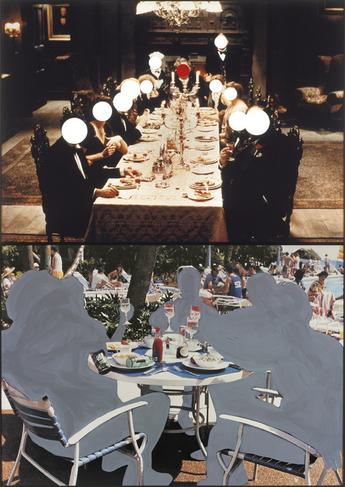
What do you notice about these two juxtaposed images? What do you think is going on in each section?
In the top image of American artist John Baldessari’s vertically stacked diptych Two Compositions (Formal/Informal; Interior/Exterior) (1990), the faces of the diners arranged around a long dinner table are obscured by circles of monochromatic paint. The red dot at the center of the image highlights the hierarchical arrangement of the diners and draws our eye to the vanishing point of the composition. By covering the faces, Baldessari shifts attention to the diners’ clothing, body language, and setting. The ornate furnishings and elegant dress of the figures gathered around the table convey an air of aristocratic class.
In the lower image entire bodies are covered over with grey pigment and the erasure again shifts focus from the identities of the figures to their setting and the objects around them: an exterior scene with sunbathers in the background, patio furniture, and condiment bottles.
In this work Baldessari employed methods of appropriation and deletion to question how visual conventions inform the way we interpret images, in this case comparing the visual cues that communicate an atmosphere of formality versus one of informality. His intervention of obscuring faces and bodies limits the possibility of identification with the people pictured or the reading of a narrative into the images, instead focusing attention on the pictorial strategies that communicate class, rank, and authority among members of a social group.
The two images in Two Compositions (Formal/Informal; Interior/Exterior) are movie stills from the films Haunted Honeymoon (1986) and Revenge of the Nerds II: Nerds in Paradise (1987). Artists have long borrowed, copied, altered, and otherwise appropriated existing images and objects; in the twentieth century, this tradition can be seen in the Cubist collages of Pablo Picasso and Georges Braque and the readymades of Marcel Duchamp. The term appropriation art, however, was introduced specifically in the late 1970s and 1980s, when this strategy of borrowing and altering took on a new critical dimension.
Artists associated with appropriation art enacted a critique of representation itself by using found images from advertisements, films, television, and photography. Through an emphasis on repetition, recontextualization, and creative editing, appropriation art explores fundamental questions of perception and reality. If we perceive reality through representations, do these representations become our reality? What then is truth? And in what sense is originality possible? These and similar questions prompted artists such as Baldessari to analyze the forms of expression and manipulative effects of mass-media imagery on the public.
Baldessari worked as a teacher for most of his life and saw a direct connection between his teaching practice and his art-making, as both activities centered around communication:
“A vital lesson for me was learning that teaching is about communication. Lecturing doesn't do it. You have to see the light in the student's eyes; you have to see that they get it. And if you don't see the light, then you try another approach and then another approach. I realized that that attitude was filtering into my art—that you have to communicate. Teaching and art began to cross-pollinate and one affected the other. I realized that art was about communication. I was learning how to communicate by teaching. In effect I was saying, the art I do is what I'm talking about in the classroom and vice versa and they're interchangeable.” — John Baldessari
Baldessari made slightly different interventions into each of the film stills in this artwork—only covering the faces in the top image while painting over the entire bodies of the figures in the bottom image. Why do you think he chose a different approach for each image? Do the different approaches affect how you view this work?
Hear from Baldessari about his decision to start covering the faces of people in photographs with price stickers, and see the artist at work in his studio in this video from Art21.
Up Next: Both Rauschenberg and Baldessari appropriated and modified images from popular and mass media to alter their context and meaning. We now turn to contemporary artworks that engage with the histories of gestural abstraction, assemblage, and appropriation in American and European art while also bringing these techniques into conversation with twenty-first century life.
Painterly Abstraction Today
Let’s look more closely at works by two contemporary artists who reinterpret post–World War II European and American gestural abstraction and experiment with new forms of painting that are keyed to the social and cultural experiences of today.
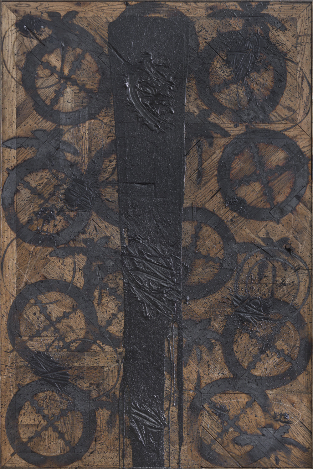
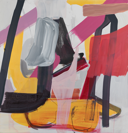
What textures and patterns do you notice in this artwork?
What materials do you think it might be made of?
Rashid Johnson’s artistic practice is characterized by an examination of both the construction of identity—specifically his own identity as a middle-class African American man—and the historical practices of abstraction. To make Express (2013) Johnson branded wooden flooring boards using custom-made branding irons that replicate the crosshairs of a gun sight, palm trees, and geometric shapes. Images of crosshairs appear repeatedly in his work, a nod to the pioneering rap group Public Enemy, which used the symbol on its albums and merchandise as a reference to the ongoing targeting and killing of Black Americans. The act of branding the wood boards additionally carries sinister connotations stemming from the history of branding enslaved people’s bodies. Splatters of wax mixed with black soap and gouges in the surface of the wood contribute multiple layers of textured mark-making that reflect Johnson’s ongoing dialogue with modernist abstraction.
Johnson started out working in photography as an art student in Chicago, and he describes how his experimentation with photographic processes evolved into his later incorporation of unconventional art materials into his paintings and sculptures:
“I was working with a lot of nineteenth-century photographic process materials, and when you're working with those materials quite a bit of what you're doing is actually like physically applying the photosensitive chemistry to the paper. So it got me very interested in paper, it got me very interested in materials, and how material was being applied, and how physically I was participating with it, which I think later on leads me to melting black soap and wax and pouring it. So I think it was a very natural progression for me.” — Rashid Johnson
The black soap and shea butter that Johnson frequently incorporates into his work carry cultural associations as cleansing and healing products with roots in West Africa and resonate personally for the artist, who identifies them with childhood memories:
“When I was about twenty-two I started going to the Russian Turkish bath house all the time . . . and so it really became kinda almost like a temple to me, almost a religious space, and I’ve always wanted to find a material, or something I could kinda use to have a conversation about cleansing, like a psychological cleansing as well as physical cleansing. Shea butter for me, when I was young, my mom would bring it from west Africa and we’d have it in the house, and over time I started thinking, ‘We’re like putting Africa on ourselves, right? We’re like essentially kinda coating ourselves with this African product.’ I’ve always been interested in the domestic, in around kinda hijacking things we’re familiar with and essentially occupying them or translating them through different filters.” — Rashid Johnson
What materials or products do you associate with cleansing and health?
Does Express remind you of any of the other artworks we’ve looked at on this tour? If so, in what ways?
In this Art21 video Rashid Johnson speaks about his career-long fascination with materials and processes.
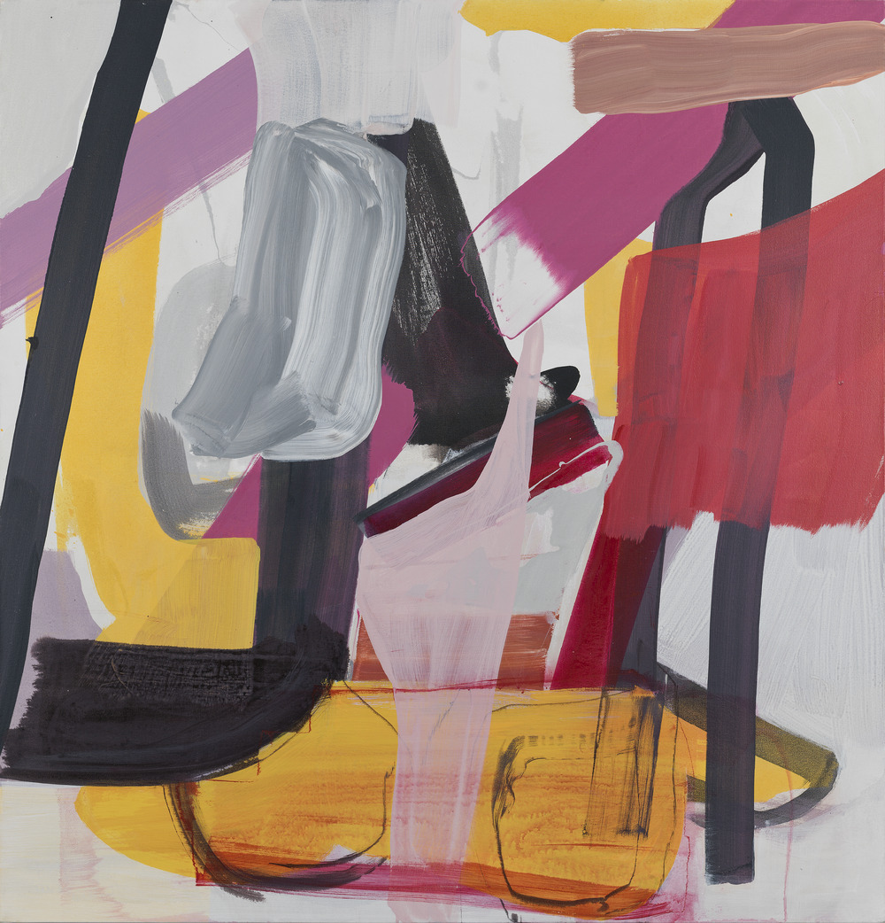
Take a moment to look at the layered brushstrokes and washes of color in this painting. What details draw your eye?
A vibrant, gestural painting, Cart (2017) presents a layered space made up of bold brushstrokes and a bright palette of warm pinks, hot reds, and sulfuric yellows. American artist Amy Sillman’s process usually begins with a largely intuitive application of paint, which triggers a chain of decisions involving multiple readjustments of color, shapes, positions, and size. For Sillman it is the durational process of art-making—of construction, deconstruction, and reconstruction—that generates meaning in her work:
“It’s both knowing and deciding things, and also rejecting things, and emotionally hating things, and reversing things, and then remaking them and being surprised, that’s basically the interest that I have in making art. It’s a kind of devotion to a procedure of transformation.” — Amy Sillman
For Sillman, who attended art school in the late 1970s, the already outmoded practice of Abstract Expressionism was understood as “something grand lying around the dollar bin at the secondhand bookstore, something to be looked at, cut up, and used as material.” Sillman’s gestural and colorful compositions respond to the formal vocabulary of Abstract Expressionism but are divorced from the heroic rhetoric associated with that movement.
Arriving at a final composition is, for the artist, a matter of building feelings of dissatisfaction, doubt, and awkwardness into a form, what she calls an “ill-fitting, strange, clumsy” thing that “feels right without knowing why.” Ambivalence and fixation become in Sillman’s paintings productive engines for contemporary art, and her work takes on corporeal dimensions:
“To be honest, this is exactly how I have always seen painting, or art in general: as the sensation of ill-fitting parts. That points back to the idea of shapes, and the intimacy of parts and labor, of staying close to the body and working from the grassroots, from detail to fussy detail. And in the trimming, adjusting, editing, messing around with shapes, one works not only from the individual expressive body, but with body politics—a politics that, like shapes, includes everything: our ambiguities, our dysphoria, our skin tones, our histories and consciousnesses, all the uncertainties, dangers, ugliness, eroticism, absence—the nights, fogs, dreams, and depth perceptions of our rhythms, losses, laments, and even our senses of humor, as we approach a kind of limit condition at the dead end of seriousness.” — Amy Sillman
Are there passages in Cart in which you can perceive traces of Sillman’s process of repeatedly altering and readjusting the composition?
Sillman embraces what are often thought of as negative emotions and states of being, like awkwardness, as forces for creation. Do you relate to Sillman’s attraction to what she calls “wrong feelings” in her art practice? What kinds of emotions drive your creative projects or the work that you do?
Take a peek into Amy Sillman’s studio in this video produced by the Institute of Contemporary Art, Boston:
Notes
Baldessari, John. “Just an Artist.” Interview by Art21. July 2008. https://art21.org/read/john-baldessari-just-an-artist/ .
“Conversation about Manolo Millares.” Interview with Elvireta Escobio and Alfonso de la Torre by Llucià Homs. Madrid, January 20, 2017. https://www.delatorrealfonso.com/2019/05/07/conversation-about-manolo-millares/ .
Curley, John J. “Spotlight Essay: Willem de Kooning.” In Spotlights: Collected by the Mildred Lane Kemper Art Museum, edited by Sabine Eckmann, 177–82. St. Louis: Mildred Lane Kemper Art Museum, 2016. https://www.kemperartmuseum.wustl.edu/learn/learning-resources/de-kooning-willem-saturday-night-1956/type/essays.
De la Torre, Alfonso. “Manolo Millares: A Deliciously Strange World,” 2016. https://www.delatorrealfonso.com/2016/06/23/manolo-millares-a-deliciously-strange-world/ .
“John Baldessari in ‘Systems.’” Art in the Twenty-First Century. Season 5. Aired October 28, 2009, on PBS. https://art21.org/watch/art-in-the-twenty-first-century/s5/john-baldessari-in-systems-segment/ .
Manchanda, Catharina. “Spotlight Essay: John Baldessari.” In Spotlights: Collected by the Mildred Lane Kemper Art Museum, edited by Sabine Eckmann, 215–17. St. Louis: Mildred Lane Kemper Art Museum, 2016. https://www.kemperartmuseum.wustl.edu/learn/learning-resources/baldessari-john-two-compositions-formal-informal-interior-exterior-1990/type/essays.
Millares, Manolo. “El homúnculo en la pintura española actual.” Papeles de Son Armadans 13, no. 37 (April 1959).
“Rashid Johnson Keeps His Cool.” Art 21. New York Close Up. April 3, 2015. https://art21.org/watch/new-york-close-up/rashid-johnson-keeps-his-cool/ .
Rauschenberg, Robert. Oral history interview by Dorothy Seckler. December 21, 1965. Archives of American Art, Smithsonian Institution, Washington, DC.
Seitz, William C. The Art of Assemblage. New York: Museum of Modern Art, 1961.
Sillman, Amy. “On Color.” In Painting Beyond Itself: The Medium in the Post-Medium Condition, edited by Isabelle Graw and Ewa Lajer-Burcharth, 103–16. Berlin: Sternberg Press, 2016.
Sillman, Amy. “Shit Happens: Notes on Awkwardness.” Frieze, no. 22 (December 2015–February 2016). https://frieze.com/article/shit-happens .
Sillman, Amy and Michelle Kuo. Shapes: The OG 14 (Spring 2020). moma.org/shape_zine.
“Studio Visit: Amy Sillman.” ICA Boston. May 21, 2015. https://www.youtube.com/watch?v=eRmaq4hAcTg&feature=youtu.be .
Willem de Kooning (American, b. Netherlands, 1904–1997), Saturday Night, 1956. Oil on canvas, 63 3/4 x 70". University purchase, Bixby Fund, 1956. © The Willem de Kooning Foundation / Artists Rights Society (ARS), New York.
Manolo Millares (Spanish, 1926–1972), Cuadro No. 82 (Painting No. 82), 1960. Oil on torn burlap, 39 x 52 1/4". Gift of Mr. and Mrs. Richard K. Weil, 1972. © Manolo Millares / Artists Rights Society (ARS), New York.
Robert Rauschenberg (American, 1925–2008), Choke, 1964. Oil and silkscreen on canvas, 60 x 48". Gift of Mr. and Mrs. Richard K. Weil, 1972. © Robert Rauschenberg Foundation / Licensed by VAGA at Artists Rights Society (ARS), New York.
John Baldessari (American, 1931–2020), Two Compositions (Formal/Informal; Interior/Exterior), 1990. Color photographs and vinyl paint. 96 1/4 x 68 1/8 x 1 3/8". University purchase, Charles H. Yalem Art Fund, 1992. © John Baldessari.
Rashid Johnson (American, b. 1977), Express, 2013. Black soap and wax on branded red oak flooring. 72 1/2 x 48 1/2 x 2 1/2". University purchase, Parsons Fund and Bixby Fund, 2013.
Amy Sillman (American, b. 1955), Cart, 2017. Acrylic on canvas, 51 x 49 x 1 1/2". University purchase, Parsons Fund, 2017.
All artworks are copyright the artist or the artist’s estate unless otherwise specified. Images on this tour are for educational purposes only and are not licensed for commercial applications of any kind.
We are committed to encounters with art that inspire creative engagement, social and intellectual inquiry, and meaningful connections across disciplines, cultures, and histories. Do you have ideas or suggestions for other learning resources? Is there an artist or topic that you would like to learn more about? We would love to hear your feedback. Please direct comments or questions to Meredith Lehman, head of museum education, at lehman.meredith@wustl.edu.
Related Content
go to Willem de Kooning, Saturday Night, 1956 page
Artwork essays
Willem de Kooning, Saturday Night, 1956
go to John Baldessari, Two Compositions (Formal / Informal; Interior / Exterior), 1990 page
Artwork essays
John Baldessari, Two Compositions (Formal / Informal; Interior / Exterior), 1990
go to Guided Close Looking: Willem de Kooning, “Saturday Night” page
Learning
Guided Close Looking: Willem de Kooning, “Saturday Night”
go to "Stacking Traumas": Communicating Sound, Negotiating Trauma page
Learning
"Stacking Traumas": Communicating Sound, Negotiating Trauma
go to 19th- and Early 20th-Century American and European Art page
Learning
19th- and Early 20th-Century American and European Art
go to Across Past, Present, and Future: Art by Black Artists page
Learning
.png)